



How to improve landing page conversion rate: 7 fixes backed by data on reading level, speed, mobile and forms, plus a simple way to test them this month.
You pay for the click. You write the ad. You send people to a page that should do the rest. Then 94 out of every 100 of them leave without doing anything.
Sound familiar?
That's roughly what happens on the typical landing page. Unbounce's benchmark of 41,000 landing pages puts the all-industry median conversion rate at 6.6%. If your page sits near that number, you're normal. You're also leaving a lot of money on the table.
This guide shows you how to improve landing page conversion rate with seven fixes you can make without a redesign, in the order I'd tackle them.
Key Takeaways
- The median landing page converts at 6.6%, so a 'good' page is one that beats its own last month, not a number from a blog post.
- Copy written at a 5th to 7th grade reading level converted at 11.1% in Unbounce's data, against 5.3% for professional-level writing.
- A 0.1 second faster mobile site lifted retail conversions by 8.4% and travel conversions by 10.1% in a Google-commissioned study.
- Mobile brings most of the visits but converts worse than desktop, so you should design and check the phone version first.
- Change one thing at a time and let each test run long enough to mean something, or you'll never know what worked.
First, Know What 'Good' Looks Like
Before you change anything, find your baseline. Pull the last 30 to 90 days of visits and conversions for the page, split by device and by traffic source.
Then compare it with the right yardstick. Unbounce's dataset covers more than 464 million visitors and 57 million conversions across five industries: financial services, health and wellness, professional services, SaaS and ecommerce. Search Engine Journal's summary of the same report shows industry medians ranging from 3.8% to 12.3%.
That spread matters. A SaaS page and a financial services page are playing different games. Compare yourself to your own history first and your sector second.
One more thing: define the conversion. A newsletter signup and a booked sales call are not the same event. Pick the one that leads to revenue and measure that.

Fix 1: Write Like You Talk
This is the cheapest fix and often the biggest.
Unbounce's 2024 report found that pages written at a 5th to 7th grade reading level had a median conversion rate of 11.1%. Pages at an 8th to 9th grade level managed 7.1%, and professional-level writing 5.3%.
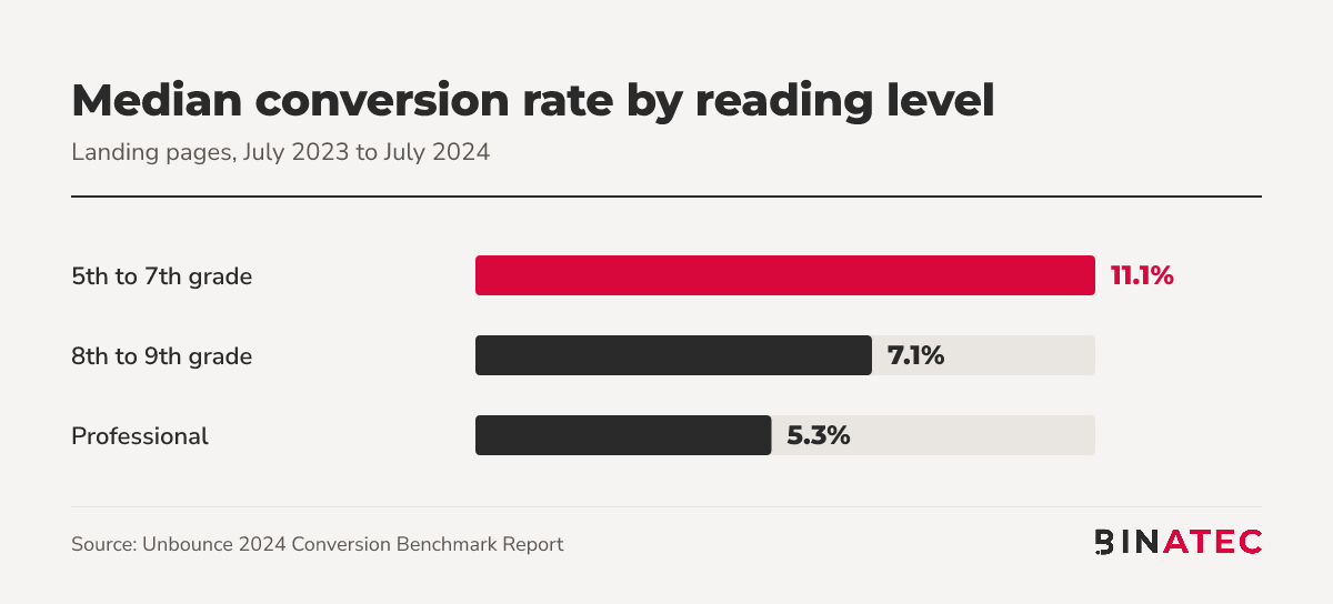
The same report says difficult words are the factor most strongly linked to lower conversion rates. Simple doesn't mean childish. It means your reader doesn't have to work to understand what you sell.
Here's how to do it this week:
- Paste your headline and first two paragraphs into a readability checker.
- Swap jargon for the word your customer actually uses.
- Cut every sentence that doesn't help someone decide.
- Read it aloud. If you stumble, your visitor will too.
Fix 2: Make the Headline Match the Ad
Someone clicks an ad promising 'same-day roof repair quotes'. They land on a page headed 'Quality Roofing Solutions'. They hesitate, then leave.
Your headline should repeat the promise that earned the click, in nearly the same words. That one change tells the visitor they're in the right place.
If you run several ad groups, build several versions of the page. A landing page and funnel build per audience beats one page that tries to speak to everyone.
Fix 3: Speed Up the Mobile Page
Speed gets talked about like a technical chore. It's a sales lever.
A study commissioned by Google and run with Deloitte tracked 37 brand sites and over 30 million sessions. It found a 0.1 second improvement in mobile speed raised conversion rates by 8.4% for retail sites and 10.1% for travel sites.
That's a tenth of a second. Most pages are far slower than they need to be.
Start with the usual suspects:
- Oversized hero images that should be compressed and sized for phones.
- Chat widgets, heatmap scripts and tag-manager clutter loading before the page is usable.
- Web fonts and sliders that delay the first screen.
If you want a second pair of eyes, our technical SEO work covers Core Web Vitals checks.
Fix 4: Design for Phones First
Here's the uncomfortable part. According to Search Engine Journal, mobile accounts for 83% of landing page visits, yet desktop pages convert 8% better.
In the press release for the same report, professional services pages showed a bigger gap: desktop converted 40% better while mobile sent over four times the traffic.
So the phone version is where most of your visitors are, and where you're probably losing the most.

Check your own page on a real phone:
- Can you read the headline and see the button without scrolling?
- Is the button big enough to tap with a thumb?
- Does the form open the right keyboard (number pad for phone numbers)?
- Can you finish the whole thing one-handed?
Fix 5: One Page, One Job, One Button
A landing page isn't your homepage. Remove the main menu, the footer link maze and the second offer in the sidebar.
Every extra link is a way out. Keep one clear action, and repeat the same button text at the top, the middle and the end of the page.
Make the button say what happens next. 'Get my free quote' beats 'Submit' because the visitor knows what they're getting.
Fix 6: Ask for Less in the Form
Every field is a small tax on the visitor. The question is whether you need the answer now.
My rule: ask only for what you need to follow up. A name, an email and one qualifying question will do for most B2B pages. You can collect company size and budget on the call.
I haven't found a rigorous public study that gives one perfect number of fields, and the dramatic case studies you see online are usually one-off tests. So treat this as a hypothesis to test on your own page, not a law.
Fix 7: Add Proof Near the Button
People hesitate at the moment of commitment. Put your best evidence right there.
Good proof is specific and real:
- A named customer quote with their role and company, used with permission.
- Logos of clients you've worked with.
- A review count and rating from a platform visitors recognise.
- A plain guarantee or process line, such as 'We reply within one business day'.
Never invent testimonials or numbers. Weak proof is worse than none because it makes the whole page feel fake.
How to Test Without Fooling Yourself
Now you have seven fixes. Don't launch them all at once.
If you change the headline, the form and the button in one go, and conversions rise, you won't know why. Change one thing, run it against the original, and keep the winner.
A simple testing routine:
- Write a one-line hypothesis: 'Shorter headline copy will lift form fills because it's easier to scan.'
- Split traffic evenly between the old and new version.
- Run it for full weeks so weekday and weekend behaviour both count.
- Wait until you have enough conversions in each version to trust the gap.
- Record the result, win or lose, and move to the next fix.
If your page gets little traffic, tests will take a long time. In that case make the changes you have solid evidence for, like plain language and speed, and compare before and after. Our UX and A/B testing team can help you decide which route fits.
A Quick Example: Putting It Together
Picture a small accounting firm running Google Ads to a page headed 'Comprehensive Fiscal Advisory Solutions'. It has a menu, a seven-field form and a hero image that takes ages to load on a phone.
Applying the fixes in order, you would:
- Rewrite the headline to match the ad: 'Small business tax help, with a free first call'.
- Drop the jargon and shorten the paragraphs.
- Compress the hero image and remove two unused scripts.
- Remove the menu and keep one 'Book my free call' button.
- Cut the form to name, email and phone.
- Place a real client quote beside the button.
This is an illustration, not a client result. The point is the order: clarity first, then speed, then friction, then proof.
When Landing Page Tweaks Won't Help
Sometimes the page isn't the problem. If the wrong people are arriving, no headline will rescue it.
Look upstream if you see this:
- High bounce rates from one keyword or audience while others convert fine.
- Plenty of leads that never turn into sales.
- An offer that doesn't solve a problem your buyers rank as urgent.
In that case fix targeting and the offer first. Our conversion rate optimisation work usually starts there, not with button colours.
FAQs
What is a good landing page conversion rate?
Unbounce's analysis of 41,000 pages found a 6.6% median across industries, with sector medians between 3.8% and 12.3%. A good rate is one that beats your own baseline and your sector's median, and still brings in leads you can sell to.
How long should I run a landing page test?
Run it for at least one or two full weeks so weekday and weekend behaviour are both included, and until each version has enough conversions to show a clear gap. Stopping the moment one version looks ahead is the most common way to pick a false winner.
Does page speed really affect conversions?
Yes. A Google-commissioned study of 37 sites found that a 0.1 second mobile speed gain raised conversion rates by 8.4% for retail and 10.1% for travel. Your results will vary, but speed is one of the few fixes with solid evidence behind it.
Should I use a separate landing page for each ad?
Where the audience or search intent differs, yes. A page whose headline repeats the ad's promise reassures the visitor immediately. If the intent is the same across ads, one page with a matching headline is usually enough.
Conclusion
The idea to remember: your landing page is a conversation with someone who's in a hurry. Use plain words, load fast on a phone, ask for one thing and show proof.
This week, read your page on your own phone, rewrite the headline to match your best ad, and measure what happens. Small, sourced changes add up.
If you'd like a second opinion on your page, you can get a free quote and we'll tell you where we'd start.
Sources
- Unbounce: average landing page conversion rates (Q4 2024 data)
- Unbounce 2024 Conversion Benchmark Report (press release)
- Search Engine Journal: mobile landing page conversion gap
- web.dev: Milliseconds Make Millions (Google and Deloitte)


John Doe
Supreb Information. Thanks
15 July 2014 View replies . 1